Introduction
"A11y Fast" is a series of small and quick improvements that developers can make when updating or auditing websites for usability and accessibility. I'm on my own journey of education around accessibility, and I'm writing about many of these tips as I learn them. If you have any corrections or comments for me, I'm open to learning more from you! Reach out to me on Threads or LinkedIn.
First up in the series, links! And more specifically, link purpose! In this post, I'll walk through what link purpose is and why it's important to consider, how to find and fix link purpose issues on your own website, and lastly, where to learn more and find link purpose in the WCAG (web content accessibility guidelines) specification.
What is link purpose?
Have you ever seen a link with a text of "read more" or "more" or something similar? I'm sure you probably have, even if you didn't have to think about it. I've designed and built plenty of links just like this! Sometimes, they come at the end of a sentence, prompting you to "learn more" about a topic, or even a "click here" link to point someone to another page or section of the page.
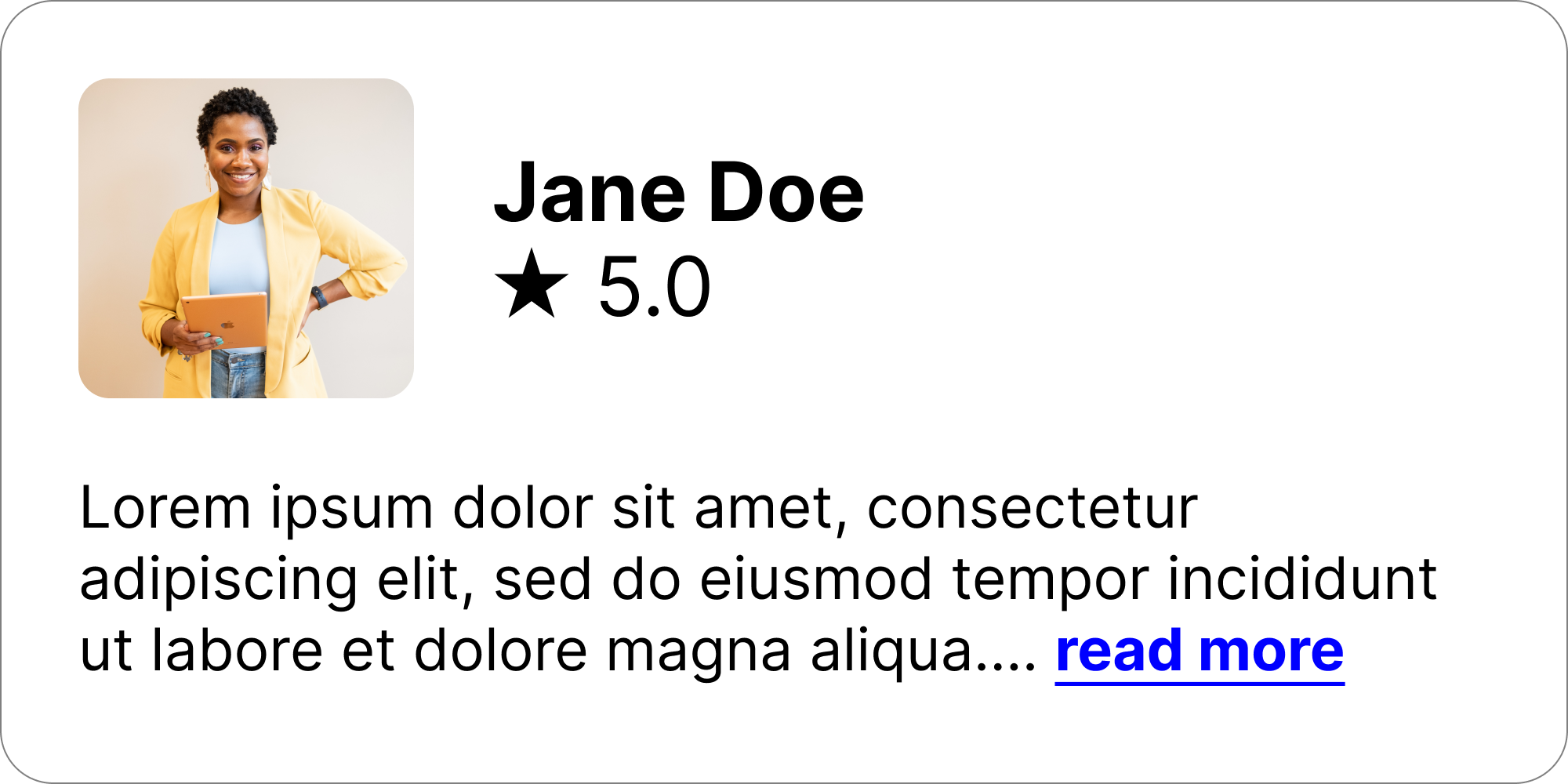
As an example, in the above image, the link may make perfect sense to a neurotypical sighted user. They see a sentence with an ellipsis ("...") at the end of it and a link to "read more". They will probably conclude that the link will either expand the bio to show more text or take them to another page to read more.
Providing context for links
The above image shows a "read more" link within the context of a paragraph. Meaning, the link alone may not mean anything, but when read aloud in context, as part of the preceding paragraph, it would still make sense. Importantly here, a link's purpose needs to be programmatically determinable.
Adding context to a link through an enclosing <p> is one of many ways to context for links in a way that can be programmatically determined.
Other methods include:
- Including the link in a list item
<li>that also contains text describing the link - Using
aria-labeledbyoraria-labelto add context to a link - Making sure links in a data table can be understood in the context of the cell and cell's header
For a full list of ways to provide valid link context, see the Understanding link purpose in context page from the W3C
Links without context
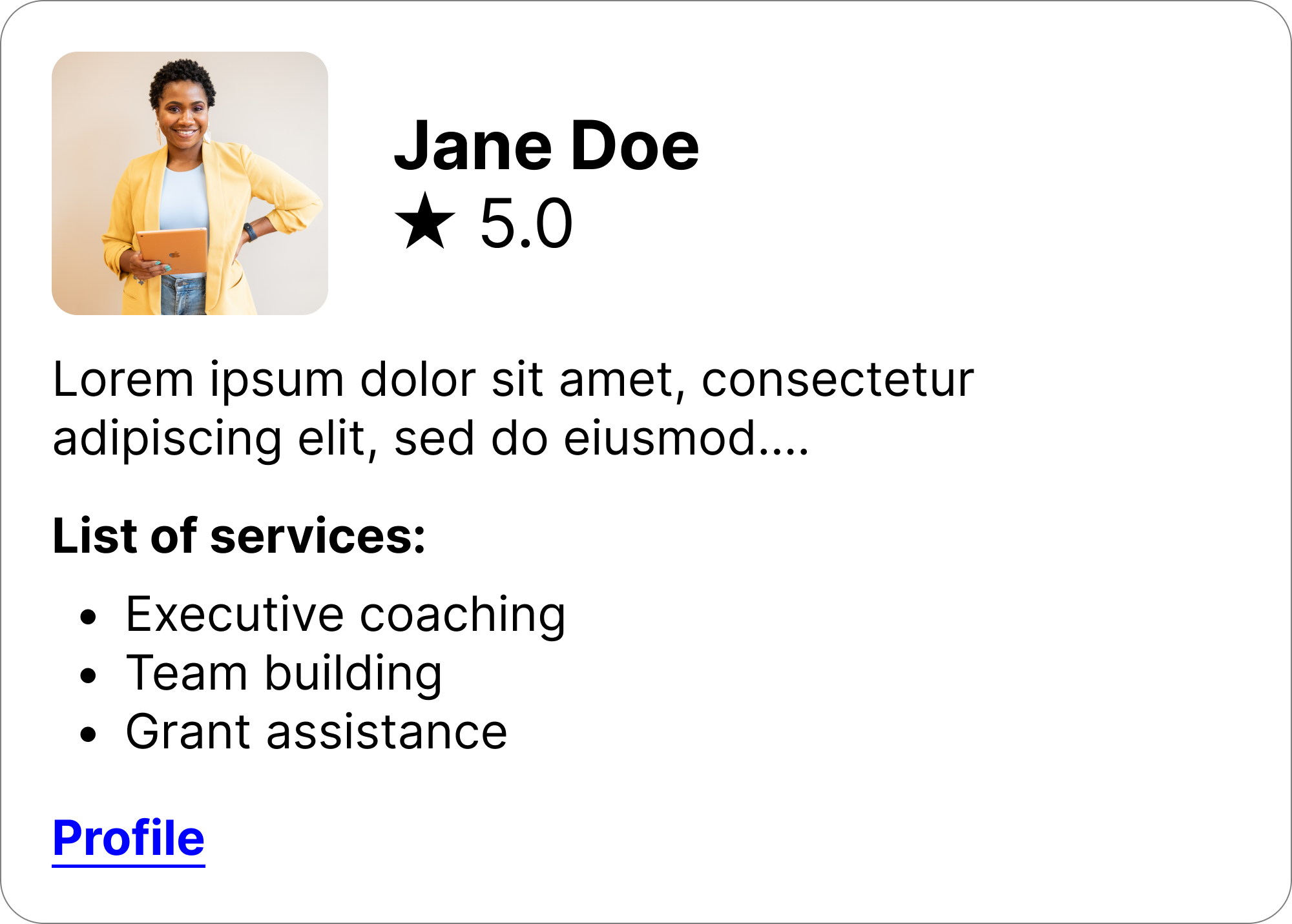
Many links don't have a way of programmatically determining their context, meaning they don't exist in a li p or other element that can provide context for them. To illustrate, we can change the design of the above bio card, add a list of serices provided by the user, and move the "read more" link to the bottom of the card.
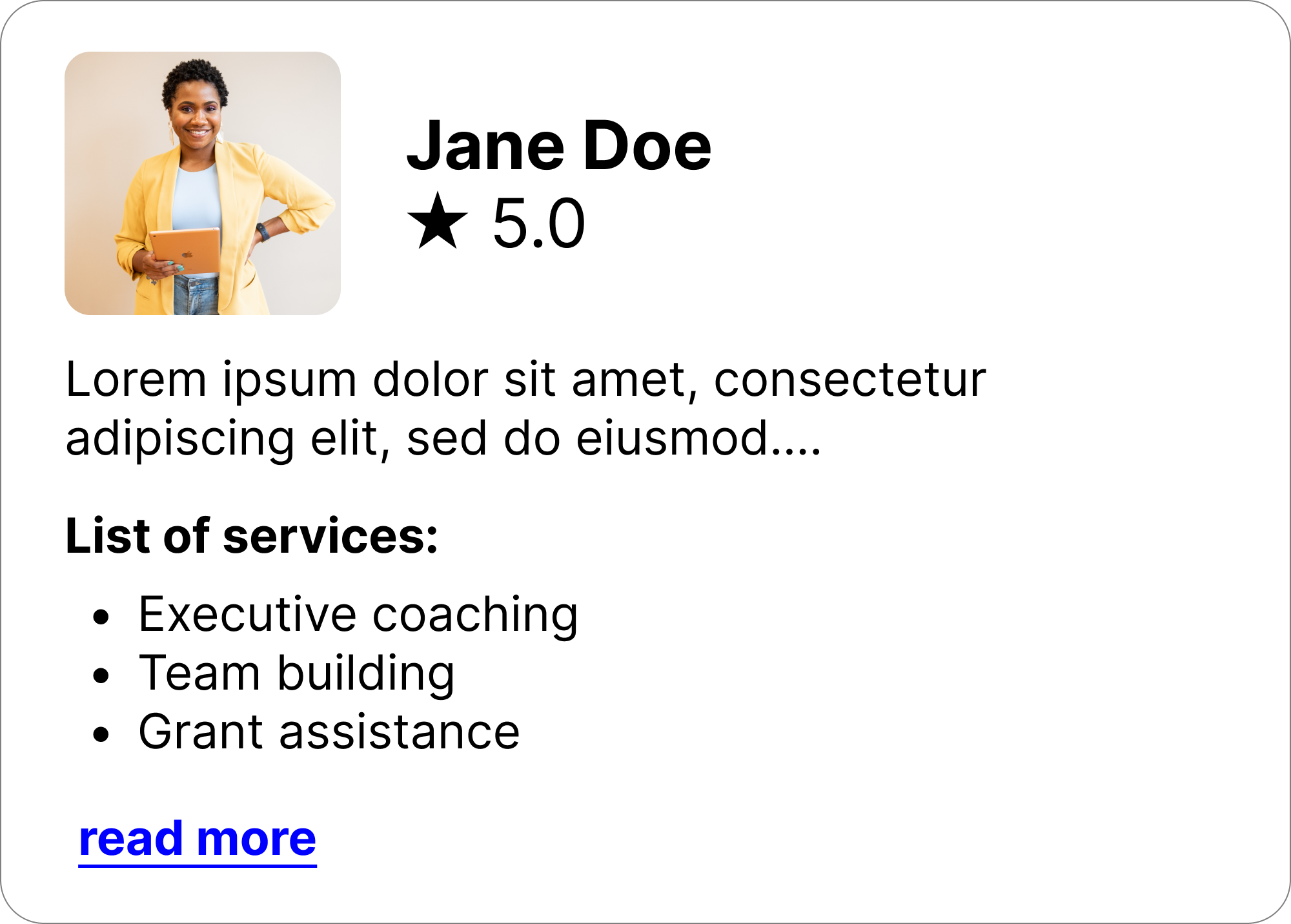
For starters, the bio here is still truncated, and then there's a list of services offered by this person. Now what does the "read more" link take you to? Does it take you to a profile page? Does it expand the truncated bio? Or are there more services offered?
This may seem like a simple example, but with more information-dense layouts, links like this could actually be pretty tough to reason about. For these reasons, links without a clear context or purpose should have a reasonable text description of their purpose
A note on screen readers
Users who use screen readers have a few ways of navigating a page. They may listen to the page sequentially, but most commonly, users navigate through a combination of headers, and other elements on the page
WebAIM's 2021 survey of screen reader users showed that about 7.1% of users navigate a page using links. While it is much more common for them to navigate with headings (67.7%), users can list out all the links on the page as well, and navigate to the place on the page where they can perform an action based off a link title.
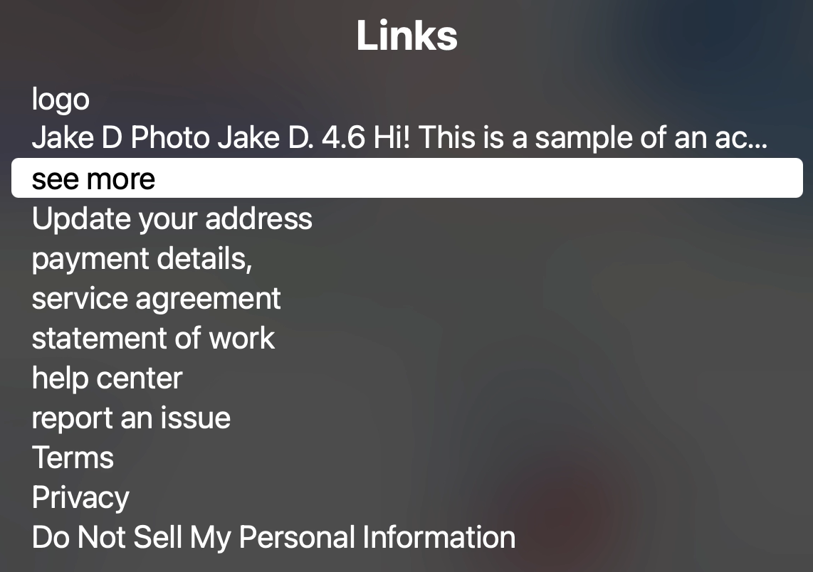
This is a photo of Mac OS's VoiceOver screen reader. It's listing all the links on the page for navigation. Most of them here make sense from their link text, like "update your address" for example. But from this list, the 3rd item down "see more" makes no sense! To a screen reader user navigating the page by link, that item is completely useless. If that link was important to operating the page successfully, the user may end up lost or need to listen to the whole page's contents to determine meaning.
The spec & compliance
WCAG 2.1 lists two relevant criterion for the operability of links:
There are plenty of details in the WCAG spec itself, but here are some of the high points
2.4.4is a level A requirement, meaning if your website is aiming for WCAG A (minimum) or AA (Common) compliance, you must be compliant with that2.4.9is a level AAA requirement, meaning if you're aiming to be compliant with the most strict accessibility standards, you need to meet this item.
The key difference between these two requirements is their context. Links, ideally, should be clear in their purpose using nothing but the text of the link itself (WCAG Level AAA compliance). If not, links should at least be clear in their purpose from the context in which it's shown, like a sentence or table cell (WCAG Level A compliance).
Conclusion
At the surface, links look like a relatively simple conversation. But with the wide range of abilities and technologies that access a website, it's important to make sure that links are clear and unambiguous in their purpose.
The easiest way to accomplish this is through the text of the link itself, but there are other ways to make a link clear. ARIA attributes, paragraph context, and more can be used to make sure a link is understandable and usable by everyone who uses your products.
Did I miss anything here? Are there other things that I should have considered or mentioned? I'm writing about these topics as I learn them, so I'm sure things will come up, but I'm here to learn! You can reach out to me on Threads or LinkedIn if you have questions or corrections for me! Or if you just want to follow along, that's okay too!