
Introduction
Many designers love inputs like these; with a label floating over the input that moves out of the way for text input when a user focuses the input. Of course they love it, though! Inputs need labels, and labels take up space. Having a label live inside the bounds of an input makes sense and helps maintain page flow, eliminating yet another item that could clutter up an otherwise clean UI.
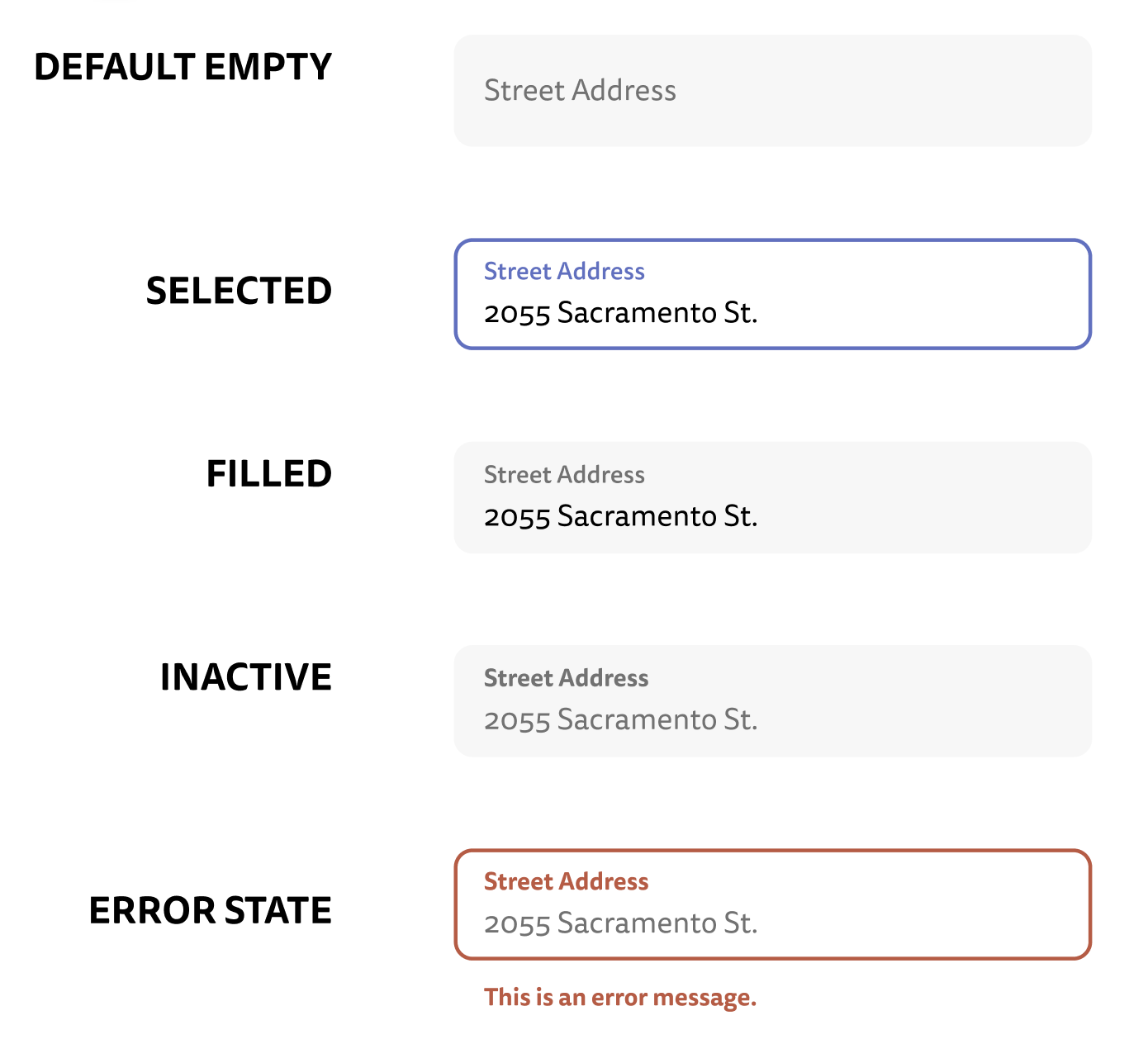
There are a dozen tutorials all over the internet on how to build this style of input, but I've yet to come across one focusing on the specific set of constraints that this post will focus on:
- Accessible first. It must be perceivable, operable, understandable, and robust
- Use Typescript, React, and Tailwind
- We'll also use a css module here for some of the more complex css that tailwind doesn't natively support. If you use Next.js, CSS modules are supported out-of-the-box, but if not, you can certainly use whatever CSS strategy your app supports.
- Support error states gracefully
- Support input masks (don't worry, if you don't need this, it's easy to leave off)
With these requirements in-place, let's get to work! Or, if you're just looking for some code to copy/paste, you can jump straight to the completed source code.
Much of the CSS used in this post originally comes from this blog post by Stanko Tadić. For more of a deep dive on how the CSS here works, read his post!
Just my type
For the component types, we want this component to act very much like any other input, with some additions; label, mask, and errorMessage. Extending React's native input type makes passing along props later that much easier.
import { InputHTMLAttributes } from 'react';

type FloatingLabelInputProps = InputHTMLAttributes<HTMLInputElement> & {
  label: string;
  mask?: string;
  className?: string;
  errorMessage?: string;
};
A little bit of HTML
Next up, we'll set up a basic HTML input and label, all wrapped in a div that helps us position everything right.
// forwardRef will make sure tools like ...register from react-hook-form still work
export default React.forwardRef(function FloatingLabelInput(
  {
    label,
    mask,
    className = '',
    errorMessage,
    ...inputProps
  }: FloatingLabelInputProps,
  ref,
) {
  // if there is a passed in id, use that. Otherwise, generate one from the label
  const id =
    inputProps.id ||
    label.toLowerCase().replace(/ /g, '-') +
      '-' +
      Math.random().toString(16).slice(2);

  return (
    <div className={className}>
      <input
        placeholder=" "
        id={id}
        // you'll want to use your own theme colors here, like gray-100
        className={`bg-lightestGray ${
          inputProps.disabled ? ' cursor-not-allowed' : ''
        }`}
        {...inputProps}
      />
      {/* the label here needs to be _after_ the <input> for the
      css to work for the floating label later*/}
      <label htmlFor={id}>{label}</label>
    </div>
  );
}
Here, we set up a few things:
- We need an
idto link theinputandlabel. If the user passes in anidto the component, we'll use that for the input. If not, we'll generate one from the text of thelabel. - We then use that
idin thelabel'shtmlForprop to link the two.
A little bit of CSS
Above, we set up the most basic of styling for the input. We'll split up styles into three categories
- Basic shape and styles not dependent on props (aside from
value)- In the accompanying css file
- Tailwind theme or prop-dependent styles
- In the component file
- Value-dependent styles
- We use some pseudo classes for this, so this will also live in the CSS module
Why pseudo classes instead of an onChange callback?
A previous version of this component I was using did everything in React with tailwind classes, but the critical issue was that the component couldn't be used natively by react-hook-form, whose register function for integrating easily with inputs uses refs to set input values asynchronously after data updates. In this case, there was no easy way for the component to difinitively know when the input had a value and move the label out of the way of the input text.
Placing the label
First up, in our index.module.css file:
/* The wrapping div of the input and label */
.container {
  position: relative;
  display: flex;
  flex-direction: column;
  min-width: 0;
}

/* Label styles while positioned in the "placeholder" state, in the
   middle of the input */
.container .label {
  position: absolute;
  pointer-events: none;
  transform: translate(0, 23px) scale(1);
  /* makes sure we can track the position of the label appropriately */
  transform-origin: top left;
  transition: 150ms cubic-bezier(0, 0, 0.2, 1) 0ms;
  font-size: 16px;
  line-height: 1;
  left: 16px;
  min-width: 0;
}

.container .input {
  display: flex;
  padding: 24px 16px 8px;
  height: 60px;
  border-radius: 8px;
  min-width: 0;
}
Now, we need to apply these styles to our component. The only thing we need to do if we're using CSS modules is import the classes and assign them to the right components
// FloatingLabelInput.tsx
import styles from './index.module.css';

// the wrapping container:
<div className={styles.container + ' ' + className} />

// the input itself
<input
  // ...
  className={styles.input + `bg-lightestGray ${
    inputProps.disabled ? ' cursor-not-allowed' : ''
  }`}
/>

// and lastly the label
<label
  htmlFor={id}
  className={styles.label}
/>
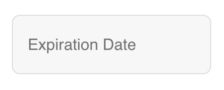
Now, the classes we just built should be automatically assigned to the components:
Moving the label
There are a two states where we want the label to jump to the top of the input:
- The
inputis focused - The
inputhas a text value
For the case of the input being focused, we can add the following CSS
/* when the input is focused, do this to the label */
.container:focus-within .label {
  transform: translate(0, 12px) scale(0.8);
  color: #5e71c4;
  font-weight: bold;
}
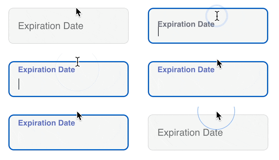
As for when the input has a value, we need to be a little more clever. First up, we need to make sure our input always has a label. We'll make it invisible, but we can just assign it a string with a single space placeholder=" ".
Then, in our CSS, add the following:
.input::placeholder {
  color: transparent;
}

.input:not(:placeholder-shown) + .label {
  transform: translate(0, 12px) scale(0.8);
  font-weight: bold;
}
The first chunk here makes the input's placeholder transparent. The second is the interesting part. It says that whenever the input's placeholder is not shown, slide up the label and make the text bold. When are placeholders not shown? When the input has a value! In Safari, this only works with an explicitly defined placeholder, thus the placeholder prop usage above.
Unfortunately, this means you can't actually use a placeholder value for the input. But using a descriptive label should be enough in most cases. You could also add a description text field to show below the input with aria-describedby.
Input masking
Input masks are extremely useful when users need to enter a specific formatted string like credit card numbers, expirations, security codes, and more. React Input Mask is a library that does just this, and closely matches the API of a basic input, making it an excellent drop-in replacement for a base input when needed.
In our case, we'll use react-input-mask whenever a mask is passed to our component, and react's base input any other time. We can pull our input's props out into a memoized object to prevent recalculation as much as possible:
  const inputCompProps = useMemo(
    () => ({
      ...inputProps,
      placeholder: ' ',
      id: id,
      className:
        styles.input +
        ' bg-lightestGray ' +
        (inputProps.disabled ? ' cursor-not-allowed' : '') +
    }),
    [id, inputProps],
  );
And in the return (we also add in our ref here, which we already set up from the forwardRef function at the start):
{
  mask ? (
    <ReactInputMask
      {...inputCompProps}
      mask={mask}
      maskPlaceholder={null}
      // @ts-ignore
      ref={ref}
    />
  ) : (
    <input
      {...inputCompProps}
      // @ts-ignore
      ref={ref}
    />
  );
}
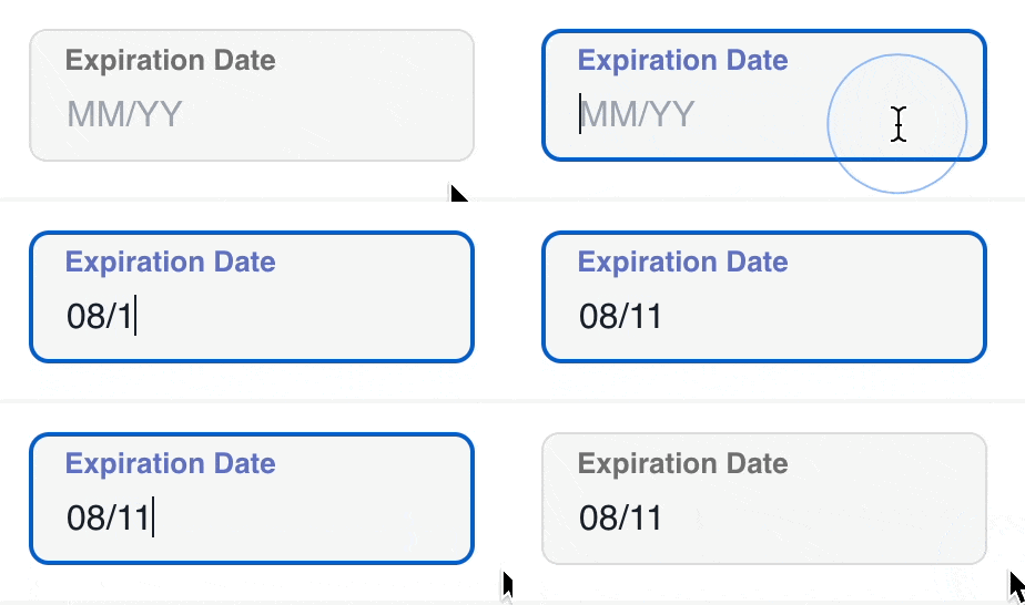
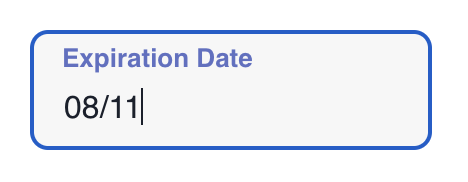
With that, the input should work with a mask, no problem! Notice the / that gets added automatically when the user types. This is accomplished by passing in a mask="99/99" prop to the component.
What about errors?
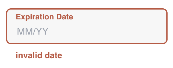
Once we've gotten the component setup and working in it's "happy path", we can add an error state using proper aria attributes for errors using the aria-errormessage and aria-invalid props. We'll assume an added errorMessage: string prop.
// inputCompProps
'aria-errormessage': errorMessage ? `${id}-error` : undefined,
'aria-invalid': !!errorMessage,

// rendered error message
{errorMessage ? (
  <p
    className="ml-4 mt-1 text-darkerRed text-sm font-bold"
    id={`${id}-error`}
  >
    {errorMessage}
  </p>
) : null}

Putting it all together
With that, the component is complete! For easier copying, here is the complete source code:
Conclusion
We built this using only a few imports, a few tailwind classes, some CSS and a bit of React. It's a component that is keyboard and screen-reader accessible by default, and usable among a wide range of cases including with tools like react-hook-form.

You could easily extend this component to include custom styling or label logic by adding more props, but did I leave something out? Could I have improved this or made it easier? Let me know on Threads. Or give me a follow to stay in the loop for future posts like this!
Additional Reading
- There is a supposed way to do all of this using only tailwind, but it's fairly lengthy and I haven't verified it works